Documentations
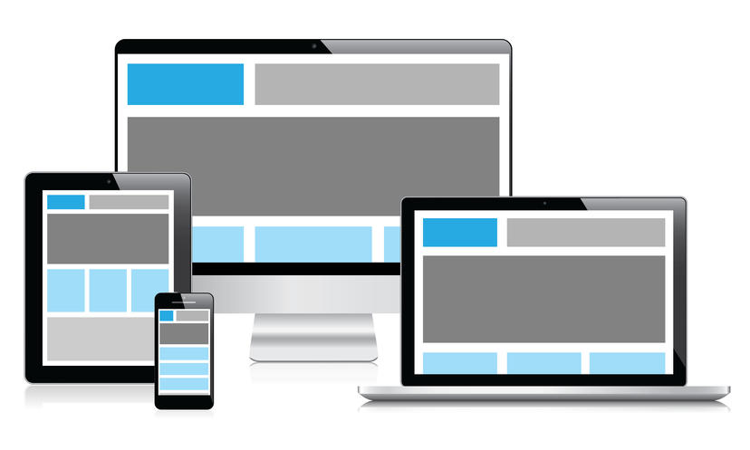
Layout Most of CSS frameworks have a responsive design, they use media queries to resize, hide, shrink, enlarge, or move the content to make it look good on any screen:
It sounds like a good idea, however, it’s not suitable for all situations.
Although frameworks help you reduce a lot of works, you still need to design for each screen size, to write redundant classes (an example for Bootstrap: <div class="col-xs-12 col-sm-6 col-md-8">), and to test on every devices.
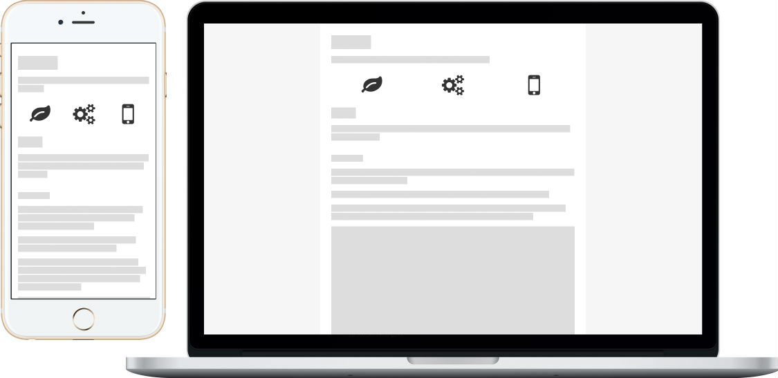
If you are building a website for mobile devices, Mobi.css provides a simpler and easier solution.
On mobile devices (with width less than 768px), your container will fill the entire width of the screen.
Otherwise, your container will have a fixed width and align to the center of the screen. Then it won’t break your design for mobile. Instead, it looks like you are viewing mobile pages on desktop.
<body >
<div class ="flex-center" >
<div class ="container" >
<h1 > Mobi.css</h1 >
</div >
</div >
</body >
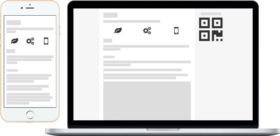
Optionally, you can add a sidebar for the desktop version of your website. It’s useful to show some additional, non-mobile messages, such as Scan to view on mobile or Back to top :
<body >
<div class ="flex-center" >
<div class ="container" >
<h1 > Mobi.css</h1 >
</div >
<aside class ="hide-on-mobile" style ="padding:0 28px;" >
<p > Scan to view on mobile</p >
<img src ="path/to/qrcode.png" />
</aside >
</div >
</body >
Margin top only Nearly all margins in Mobi.css have a 0 value for margin-bottom. For vertical spacing, Mobi.css use margin-top to make content flow clearly.
This technique allows each section to determine the spacing it needs from the element above it.
For example, <h1> ~ <h6> have 32px of vertical spacing between them. In the meantime, <p>, <ul>, <table> have only 14px of vertical spacing.
Mobi.css also provides three classes, top-gap-big, top-gap and top-gap-0 to easily override the top margin. These set margin-top to 32px, 14px and 0, respectively.
div.top-gap
p.top-gap-0
<div class ="top-gap site-box" > div.top-gap</div >
<p class ="top-gap-0 site-box" > p.top-gap-0</p >
<section class ="top-gap-big site-box" > section.top-gap-big</section >
Flexbox Mobi.css use flexbox for layout. It’s super flexible, you’ll love it.
According to caniuse flexbox , now it’s safe to use flexbox on all mobile devices as well as the last version of all major desktop browsers.
Grid system Mobile doesn’t need a complex 12# grid system. So Mobi.css provides a simple but flexible grid system.
First of all, you can create a flex-left which contains several units. In this case, flex-left‘s width is divided equally between units.
<div class ="flex-left top-gap" >
<div class ="unit site-box" > 天王盖地虎</div >
<div class ="unit site-box" > 宝塔镇河妖</div >
</div >
<div class ="flex-left" >
<div class ="unit site-box" > 曹操</div >
<div class ="unit site-box" > 刘备</div >
<div class ="unit site-box" > 孙权</div >
</div >
You can add units-gap class to ensure there are gaps between each unit. This is useful when your units have text in it.
<div class ="flex-left units-gap top-gap" >
<div class ="unit site-box" > 青龙</div >
<div class ="unit site-box" > 白虎</div >
<div class ="unit site-box" > 朱雀</div >
<div class ="unit site-box" > 玄武</div >
</div >
<div class ="flex-left units-gap" >
<div class ="unit site-box" > 金</div >
<div class ="unit site-box" > 木</div >
<div class ="unit site-box" > 水</div >
<div class ="unit site-box" > 火</div >
<div class ="unit site-box" > 土</div >
</div >
Secondly, you can use unit-1-2, unit-1-3, unit-2-3, unit-1-4 and unit-3-4 to achieve a maximum 4# grid.
<div class ="flex-left top-gap" >
<div class ="unit-1-2 site-box" > .unit-1-2</div >
<div class ="unit-1-2 site-box" > .unit-1-2</div >
</div >
<div class ="flex-left" >
<div class ="unit-1-3 site-box" > .unit-1-3</div >
<div class ="unit-2-3 site-box" > .unit-2-3</div >
</div >
<div class ="flex-left" >
<div class ="unit-1-4 site-box" > .unit-1-4</div >
<div class ="unit-3-4 site-box" > .unit-3-4</div >
</div >
<div class ="flex-left" >
<div class ="unit-1-2 site-box" > .unit-1-2</div >
<div class ="unit-1-4 site-box" > .unit-1-4</div >
</div >
Finally, you can use unit-0 as a custom size unit. Set a width to it, or let the content decide the width.
Hi, xcatliu, do you know about Mobi.css?
I sure do! Mobi.css is a lightweight, flexible css framework that focuses on mobile.
<div class ="flex-left units-gap top-gap" >
<div class ="unit-0" style ="width:62px;" > <i class ="fa fa-github" style ="font-size:56px;" > </i > </div >
<div class ="unit site-box" style ="padding:7px; margin-right:32px;" > Hi, xcatliu, do you know about Mobi.css?</div >
</div >
<div class ="flex-left units-gap top-gap" >
<div class ="unit site-box" style ="padding:7px; margin-left:32px;" > I sure do! Mobi.css is a lightweight, flexible css framework that focuses on mobile.</div >
<div class ="unit-0" > <img alt ="xcatliu" src ="/assets/img/xcatliu.png" width ="48" /> </div >
</div >
Use flexbox for aligning Forget margin:0 auto; and top:50%; margin-top:-100px;. You can align easily using flexbox!
<div class ="flex-left site-box top-gap" >
<div class ="site-box" > Mobi.css</div >
</div >
<div class ="flex-center site-box" >
<div class ="site-box" > Is</div >
</div >
<div class ="flex-right site-box" >
<div class ="site-box" > Awesome!</div >
</div >
<div class ="flex-top site-box" style ="height:60px;" >
<div class ="site-box" > Mobi.css</div >
</div >
<div class ="flex-middle site-box" style ="height:60px;" >
<div class ="site-box" > Is</div >
</div >
<div class ="flex-bottom site-box" style ="height:60px;" >
<div class ="site-box" > Awesome!</div >
</div >
<div class ="flex-center flex-middle site-box" style ="height:60px;" >
<div class ="site-box" > Mobi.css is awesome!</div >
</div >
Vertical flex layout What’s more? You can use flex-vertical to easily achieve vertical flexbox layout.
<div class ="flex-vertical site-box top-gap" style ="height:300px;" >
<div class ="unit-0 site-box" > .unit-0</div >
<div class ="unit site-box" > .unit</div >
<div class ="unit-1-4 site-box" > .unit-1-4</div >
</div >
For more examples about flexbox, please check out Reference # Flexbox .
Typography Mobi.css is designed for content-based websites. It has a pure but pleasant experience for reading.
Most typography styles are reset to not need additional classes.
This site itself is a real example. If you’ve been reading this, you can just inspect using your browser to see how it’s done.
For more examples about typography, please check out Reference # Text content .
Tables Tables typically render out of the viewable area on small mobile devices. If so, use the scroll-view wrapper to make your table scrollable.
And don’t forget to add class="table" to your <table> element!
<div class ="scroll-view" >
<table class ="table" >
<thead >
<tr > <th > Name</th > <th > Author</th > <th > Language</th > <th > Size</th > <th > Features</th > <th > GitHub</th > </tr >
</thead >
<tbody >
<tr >
<td > <a href ="http://getmobicss.com/" > Mobi.css</a > </td >
<td > <a href ="https://github.com/xcatliu" > xcatliu</a > </td >
<td > Sass</td >
<td > 3.6kb</td >
<td > <i class ="fa fa-star" > </i > <i class ="fa fa-star" > </i > <i class ="fa fa-star" > </i > </td >
<td > <a href ="https://github.com/xcatliu/mobi.css" > Mobi.css GitHub</a > </td >
</tr >
<tr >
<td > <a href ="http://getskeleton.com/" > Skeleton</a > </td >
<td > <a href ="https://github.com/dhg" > Dave Gamache</a > </td >
<td > Css</td >
<td > 3.2kb</td >
<td > <i class ="fa fa-star" > </i > </td >
<td > <a href ="https://github.com/dhg/Skeleton/" > Skeleton GitHub</a > </td >
</tr >
<tr >
<td > <a href ="http://purecss.io/" > Pure.css</a > </td >
<td > <a href ="https://github.com/yahoo" > Yahoo Inc.</a > </td >
<td > Css</td >
<td > 4.6kb</td >
<td > <i class ="fa fa-star" > </i > <i class ="fa fa-star" > </i > </td >
<td > <a href ="https://github.com/yahoo/pure/" > Pure.css GitHub</a > </td >
</tr >
<tr >
<td > <a href ="http://v4-alpha.getbootstrap.com/" > Bootstrap v4</a > </td >
<td > <a href ="https://github.com/twbs" > Twitter</a > </td >
<td > Sass, JavaScript</td >
<td > 20.1kb</td >
<td > <i class ="fa fa-star" > </i > <i class ="fa fa-star" > </i > <i class ="fa fa-star" > </i > <i class ="fa fa-star" > </i > <i class ="fa fa-star" > </i > </td >
<td > <a href ="https://github.com/twbs/bootstrap/tree/v4-dev" > Bootstrap v4 GitHub</a > </td >
</tr >
<tr >
<td > <a href ="http://goratchet.com/" > <s > Ratchet</s > </a > </td >
<td colspan ="5" > <a href ="https://github.com/twbs/ratchet/issues/792" > <s > This project is dying.</s > </a > </td >
</tr >
</tbody >
</table >
</div >
For more examples about tables, please check out Reference # Table-content .
Mobi.css believes that on mobile devices, each row should have only one input .
You need add class="form" to a <form> element and add class="btn" to each button.
<form class ="form" action ="#Basic-forms" >
<input type ="text" placeholder ="Name" />
<input type ="email" placeholder ="Email" />
<label class ="flex-middle" > <input type ="checkbox" /> I agree to terms.</label >
<input class ="btn" type ="submit" value ="Sign Up Now" />
</form >
If you want to have multiple inputs in one row, you should use the grid system.
<form class ="form" action ="#Complicated-forms" >
<div class ="flex-left units-gap" >
<label class ="unit-0 text-right" for ="multiple-inputs-name" style ="width:85px;" > Name: </label >
<div class ="unit" > <input type ="text" id ="multiple-inputs-name" placeholder ="xcatliu" /> </div >
</div >
<div class ="flex-left units-gap" >
<label class ="unit-0 text-right" style ="width:85px;" > Gender: </label >
<div class ="unit" > <label class ="flex-middle" >
<input type ="radio" name ="multiple-inputs-gender" value ="male" /> Male
</label > </div >
<div class ="unit" > <label class ="flex-middle" >
<input type ="radio" name ="multiple-inputs-gender" value ="female" /> Female
</label > </div >
</div >
<div class ="flex-left units-gap" >
<label class ="unit-0 text-right" style ="width:85px;" > Country: </label >
<div class ="unit" >
<select >
<option disabled selected value > -- select -- </option >
<option > China</option >
<option > USA</option >
</select >
</div >
</div >
<div class ="flex-left units-gap" >
<label class ="unit-0 text-right" style ="width:85px;" > Avatar: </label >
<div class ="unit" >
<input type ="file" />
</div >
</div >
<div class ="flex-left units-gap" >
<label class ="unit-0 text-right" for ="multiple-inputs-bio" style ="width:85px;" > Bio: </label >
<div class ="unit" >
<textarea id ="multiple-inputs-bio" placeholder ="Who are you?" > </textarea >
</div >
</div >
<div class ="flex-left units-gap" >
<div style ="width:85px;" > </div >
<div class ="unit" >
<button type ="reset" class ="btn btn-danger" > Reset</button >
</div >
<div class ="unit" >
<button type ="submit" class ="btn btn-primary" > Submit</button >
</div >
</div >
</form >
Warning when you are using <label> element, you can add class="flex-middle" if it’s the parent of radio or checkbox label, this makes the radio buttons align middle vertically.
You can use class="btn" outside .form.
You can also use class="btn" to make an <a> to a button.
a.btn
a.btn.btn-primary
a.btn.btn-danger
<a href ="javascript:void(0);" class ="btn" > a.btn</a >
<a href ="javascript:void(0);" class ="btn btn-primary" > a.btn.btn-primary</a >
<a href ="javascript:void(0);" class ="btn btn-danger" > a.btn.btn-danger</a >
For more examples about forms, please check out Reference # Forms .
Utilities Mobi.css also provides some useful utilities.
Text aligning You can use Mobi.css to easily align text.
我是小雨
我愛你
你愛我嗎?
<div class ="text-left top-gap" > 我是小雨</div >
<div class ="text-center" > 我愛你</div >
<div class ="text-right" > 你愛我嗎?</div >
Mobile devices usually have small width, so it’s very useful to use a scroll-view class. Mobi.css optimizes scroll-view to make it scroll smoothly.
You can set the max-height of scroll-view to override the default 300px height.
<div class ="top-gap scroll-view" style ="max-height:400px;" >
<h2 > 琵琶行</h2 >
<address > 作者:白居易</address >
<p >
浔阳江头夜送客,枫叶荻花秋瑟瑟。<br />
主人下马客在船,举酒欲饮无管弦。<br />
醉不成欢惨将别,别时茫茫江浸月。<br />
忽闻水上琵琶声,主人忘归客不发。<br />
寻声暗问弹者谁?琵琶声停欲语迟。<br />
移船相近邀相见,添酒回灯重开宴。<br />
千呼万唤始出来,犹抱琵琶半遮面。<br />
转轴拨弦三两声,未成曲调先有情。<br />
弦弦掩抑声声思,似诉平生不得志。<br />
低眉信手续续弹,说尽心中无限事。<br />
轻拢慢捻抹复挑,初为霓裳后六幺。<br />
大弦嘈嘈如急雨,小弦切切如私语。<br />
嘈嘈切切错杂弹,大珠小珠落玉盘。<br />
间关莺语花底滑,幽咽泉流冰下难。<br />
冰泉冷涩弦凝绝,凝绝不通声暂歇。<br />
别有幽愁暗恨生,此时无声胜有声。<br />
银瓶乍破水浆迸,铁骑突出刀枪鸣。<br />
曲终收拨当心画,四弦一声如裂帛。<br />
东船西舫悄无言,唯见江心秋月白。<br />
沉吟放拨插弦中,整顿衣裳起敛容。<br />
自言本是京城女,家在虾蟆陵下住。<br />
十三学得琵琶成,名属教坊第一部。<br />
曲罢曾教善才服,妆成每被秋娘妒。<br />
五陵年少争缠头,一曲红绡不知数。<br />
钿头银篦击节碎,血色罗裙翻酒污。<br />
今年欢笑复明年,秋月春风等闲度。<br />
弟走从军阿姨死,暮去朝来颜色故。<br />
门前冷落鞍马稀,老大嫁作商人妇。<br />
商人重利轻别离,前月浮梁买茶去。<br />
去来江口守空船,绕船月明江水寒。<br />
夜深忽梦少年事,梦啼妆泪红阑干。<br />
我闻琵琶已叹息,又闻此语重唧唧。<br />
同是天涯沦落人,相逢何必曾相识!<br />
我从去年辞帝京,谪居卧病浔阳城。<br />
浔阳地僻无音乐,终岁不闻丝竹声。<br />
住近湓江地低湿,黄芦苦竹绕宅生。<br />
其间旦暮闻何物?杜鹃啼血猿哀鸣。<br />
春江花朝秋月夜,往往取酒还独倾。<br />
岂无山歌与村笛?呕哑嘲哳难为听。<br />
今夜闻君琵琶语,如听仙乐耳暂明。<br />
莫辞更坐弹一曲,为君翻作琵琶行。<br />
感我此言良久立,却坐促弦弦转急。<br />
凄凄不似向前声,满座重闻皆掩泣。<br />
座中泣下谁最多?江州司马青衫湿。
</p >
</div >
Or set width of the content to achieve a horizontal scroll view.
<div class ="top-gap scroll-view" >
<div style ="width:1024px;" >
<i class ="fa fa-adjust" style ="font-size:6rem;" > </i >
<i class ="fa fa-anchor" style ="font-size:6rem;" > </i >
<i class ="fa fa-archive" style ="font-size:6rem;" > </i >
<i class ="fa fa-area-chart" style ="font-size:6rem;" > </i >
<i class ="fa fa-arrows" style ="font-size:6rem;" > </i >
<i class ="fa fa-asterisk" style ="font-size:6rem;" > </i >
<i class ="fa fa-at" style ="font-size:6rem;" > </i >
<i class ="fa fa-automobile" style ="font-size:6rem;" > </i >
<i class ="fa fa-ban" style ="font-size:6rem;" > </i >
<i class ="fa fa-bank" style ="font-size:6rem;" > </i >
<i class ="fa fa-bar-chart" style ="font-size:6rem;" > </i >
<i class ="fa fa-battery-0" style ="font-size:6rem;" > </i >
<i class ="fa fa-beer" style ="font-size:6rem;" > </i >
<i class ="fa fa-bell" style ="font-size:6rem;" > </i >
<i class ="fa fa-bicycle" style ="font-size:6rem;" > </i >
</div >
</div >
Hide or show on mobile Using hide-on-mobile or show-on-mobile to hide or show elements on mobile devices:
This part will hide on mobile devices.
<p class ="hide-on-mobile" > This part will hide on mobile devices.</p >
This part will only show on mobile devices.
<p class ="show-on-mobile" > This part will only show on mobile devices.</p >
FAQ 1. Why a flex-center in needed outside container? Actually, we use flex-center as a wrapper to ensure container aligns to the center of the screen. If you don’t add this wrapper, mobile users will not feel any difference.
Also, you can add flex-center to <body> and it will work, too. However, that is not recommended. Even though you don’t append any other elements to <body>, third-party libraries may do so. It might be hard for them to set their position in a flexbox.
2. Why doesn’t Mobi.css reset the <table> element so we don’t need to add the table class? Because once the <table> element is reset, it’s hard to set it back. It’s more friendly to third party libraries if we don’t reset <table> element. The same reason applies to <form>.
What’s next
Reference : All the Mobi.css styles in one pageExtensions : Plugins, themes, etcGitHub : Open an issue, contributing to Mobi.css